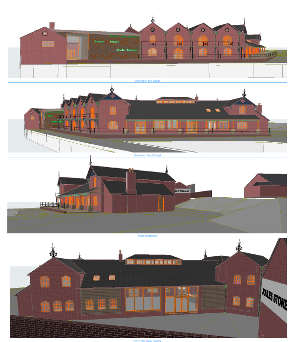
So far we have covered what happened behind the scenes over the last few years in Joule’s buying Crown Wharf. We must now break cover and in the next few posts I will try to explain the design, and as much as we really want everyone to like it, and we really do, we accept there will be a range of opinion. You, and more broadly, the public, will decide come judgement day, sometime in 2020.
This week, I want to cover the bigger picture, the design inspiration, before we go into some detail next week. It is surprisingly tricky to have a blank piece of paper, we have only ever refurbished pubs our approach is to restore as much as we can and to find the pubs soul – we have a passion for old pubs with a history – it gives them a heart, a special atmosphere and it fits with what we like doing and it also fits with our beer.
In this case, there is nothing to refurbish, on one hand that’s great, there is an opportunity to build the perfect pub, perfectly designed in every way, it has that potential. It will be our choices that define everything, it could be perfect, so a blank piece of paper is a bit daunting, it is the ultimate test.
Months passed looking at the plans, pencil in hand, with no courage to make a mark. I spent hours wandering around the carpark trying to visualise what we could create, what to build and where. The hardest part was ‘what’, it is not in our DNA to build a modern pub, and here we were, in Stone, on the old Brewery footprint with 200 years of brewing history behind us, and this will be brand new – what to do with that wonderful dichotomy?

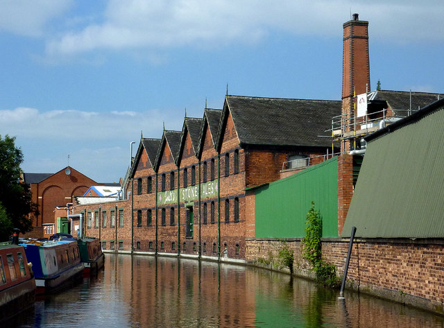
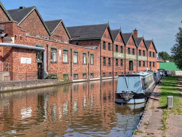
It was the weight and the joy of that history that formed the inspiration for the design. The design aims to capture the sense of stature and pride of the Joule’s mark. The old Joule’s stores next door are the most important reference, the architectural pride and attention to detail of that building is mesmerising. The dramatic roofline, the finals, the trademark cross worked into the brickwork, even the roof tiles all reveal a passion for the brand and the endeavour of brewing.

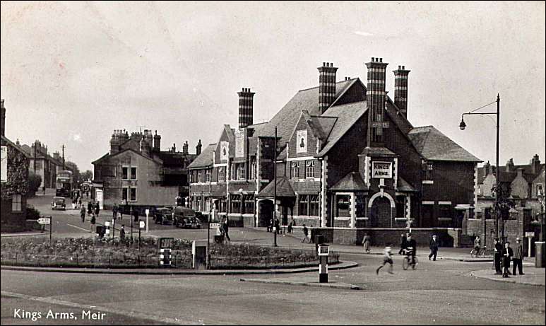
We also looked at some of the old pubs Joule’s has built, our own Lord Hill in Market Drayton was one such pub and is once again Joule’s. The greatest of them all, The Kings Arms at Mier sadly demolished, tells us something of Joule’s ambition, the pictures are inspiring and it is a call to be bold. There is a common signature of architectural drama and especially roof lines.
Once we had formed the outline vision and worked out what this should be then the architects had the very tricky task to bring this vision to life and express the plan on paper, brilliantly crafted over countless editions by Jim Entwistle of Bleazard & Galletta, an architectural practice in Wem.
Our design primarily reflects the beer store, it is the core of it. The roofline has some drama, a range of gables, with a lower roof featuring a roof light, all echo the beer stores. The architectural drama and the integration of the brand also echo the presence of Joule’s in the town, the old Brewery offices, we have cut stone internally that reference that and also the new Brewery in Market Drayton.
The whole is complemented by the Brewery period Fire Station and, with the great luck, that comes with the hose drying tower which so well echoes the old Brewery tower as well as the chimney of the warehouse. The Old Fire Station is key to the design, it is the gateway – the entrance, and the link between Crown Wharf and the town centre.
The design, by taking inspiration from the warehouse, has a robust canal-side warehouse vernacular. Different, being more diminutive, and more styled [like a pub] but the connection I hope is clear.
Tension
In design, there is a tension between the brand’s history and our passion for old pubs, and a new building which calls for contemporary influences. Our design embraces that tension and we will use reclaimed and natural materials internally pieced together in a new way. The use of reclaimed materials, express the sense of longevity and tells of a second life, of an unknown past. The Joule’s story has had several cycles, and in this, our return to Stone in 2020, after 40 years, is in itself a second life and the design will reflect that truth. The concept of a moment in time is a central thread running throughout the design, which I will detail next week.
Roofline
The dramatic roofline should feel wonderfully balanced. Wharfingers Cottage, restored, at one end, is timeless and gives way to a very modernist theatre, metal clad, hexagon, sharp lines, unlike anything else, it has a theatrical creative tone communicating its dramatic, artsy, function. This then gives way to the gabled range, 4 small gables that echo the main beer store next door, each with an exact re cast finial linking the present to the past in an explicit way – proud. The range then drops to a timber clad beer hall, echoing the lower beer store roof, with roof light, a slate roof to differentiate it before a final gable returns the line, forming a kind of bookend. This final piece will use reclaimed bricks to soften the look and mirror Wharfingers Cottage.
To the rear, we then have formed a small courtyard, backed by a theatre store which will screen the site, next to a reproduction Coopers Tavern, a Bass pub, more on that later.
Layout
I must, lastly, in this big picture summary, cover the layout of the project. The building is sited to the front of the site, it is canal side like the warehouse. We have set back, by 5 metres to form a beer terrace. This layout allows wharfingers to be seen, it provides a small courtyard entrance and most importantly connects the main pub to the canal, the pub is Canalside rather than ‘next to’ the canal. The main beer terrace overlooks the canal, the lock and the meadows beyond, it is the best view and has the evening sunshine.
This was a key choice for us, it caused some controversy with the conservation officer but was supported by the canal and river trust. The project is rooted in the Joule’s story, in the old style, robust muscular, industrial. The twist is the imaginative use of reclaimed materials which will form an unmistakably contemporary, fresh and dynamic building, reborn. We want our customers to be able to wander from the bar to the beer terrace and be Canalside, so the canal feels integral to the building.
The tensions between our old root and a modernist approach were explored at great length during planning, we did not have the support of the conservation team, they favoured modernist, and could not support our layout. We were steadfast in that we felt the most important part of this project is the Joules story and our connection to Stone.
The planners voted 8 to 4 in our favour, I worry, and still think about the 4, to say we have doubts and anxieties is an understatement, however, this project is a passion for our whole team and we can only be true to ourselves. Come 2020 there will be a range of views, that will be what it will be, but I still hope the 4, especially our local councillors, will like what we have created.


